Limited-Time 50% OFF!Get Offer
New model · great for layouts and text · ready below

Reve 2.1 Clear layouts · readable text · sharp detail

Poster sections look messy? Chinese and English labels hard to read? Write the sections and the words you need — get a clear image.

You want a poster with neat sections, or packaging where Chinese and English both stay easy to read. Describe the sections and exact words, or upload a photo and change only what you need. Reve 2.1 is already selected below.

  • Multi-section posters that stay neat
  • Chinese, English, and other text stay readable in the image
  • Sharp enough for print and large screens
  • Change one title or badge — keep the rest the same
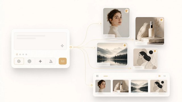
  • Generate up to 4 images at once so you can pick one
  • Write sections and words first, then lighting and materials
Reve 2.1 product hero — multi-panel frosted-glass layout sculpture with pearl type
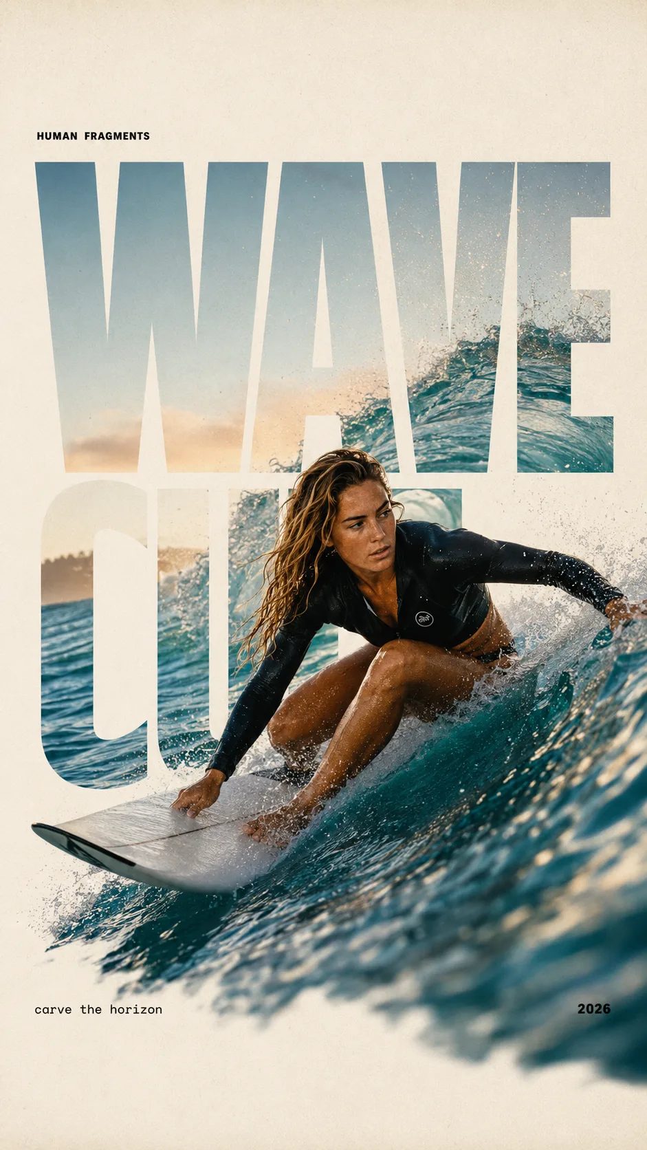
HUMAN FRAGMENTS editorial poster sample

Create a 9:16 editorial poster in the HUMAN FRAGMENTS visual system. Theme: [surfing / basketball / boxing / cake decorating] Subject: [gender, age, appearance, outfit] Action: [specific movement or handcraft] Scene: [location and environment] Title: [custom two-word title] Supporting line: [one short phrase] Year: 2026 Use oversized cropped typography as the main structural framework. The letters should act as windows that reveal the surrounding environment, while the main person remains visually complete in front of the type. Do not let the letters cut through the face, torso, arms, thighs, or other important parts of the body. Let one key action element break beyond the typography to create strong depth: 1. WAVE CUT — a surfer carving across a rising wave, with the board nose, hand, water spray, and curled wave breaking outside the letters. 2. RIM RISE — a basketball player reaching toward the hoop from a camera placed above the rim, with the basketball, hand, and hoop fully outside the letter masks and aligned naturally. 3. IMPACT FRAME — a boxer throwing a straight punch toward the camera, with the foreground glove enlarged and breaking beyond the typography while the gym remains inside the letters. 4. SOFT SWIRL — a graceful young woman decorating a cake, with the piping bag, hands, cake, and cream details extending beyond the letters while the bakery interior appears inside the type. Use realistic photography, believable anatomy, natural skin texture, strong foreground perspective, subtle paper grain, a warm off-white background, restrained colors, and clean editorial spacing. Keep the text minimal and freely placed: [Title] HUMAN FRAGMENTS [Short supporting line] 2026

Create a 9:16 editorial poster in the HUMAN FRAGMENTS visual system. Theme: [surfing / basketball / boxing / cake decorating] Subject: [gender, age, appearance, outfit] Action: [specific movement or handcraft] Scene: [location and environment] Title: [custom two-word title] Supporting line: [one short phrase] Year: 2026 Use oversized cropped typography as the main structural framework. The letters should act as windows that reveal the surrounding environment, while the main person remains visually complete in front of the type. Do not let the letters cut through the face, torso, arms, thighs, or other important parts of the body. Let one key action element break beyond the typography to create strong depth: 1. WAVE CUT — a surfer carving across a rising wave, with the board nose, hand, water spray, and curled wave breaking outside the letters. 2. RIM RISE — a basketball player reaching toward the hoop from a camera placed above the rim, with the basketball, hand, and hoop fully outside the letter masks and aligned naturally. 3. IMPACT FRAME — a boxer throwing a straight punch toward the camera, with the foreground glove enlarged and breaking beyond the typography while the gym remains inside the letters. 4. SOFT SWIRL — a graceful young woman decorating a cake, with the piping bag, hands, cake, and cream details extending beyond the letters while the bakery interior appears inside the type. Use realistic photography, believable anatomy, natural skin texture, strong foreground perspective, subtle paper grain, a warm off-white background, restrained colors, and clean editorial spacing. Keep the text minimal and freely placed: [Title] HUMAN FRAGMENTS [Short supporting line] 2026
Use the Reve 2.1 generator for packaging and posters

Clear sections and readable words in one image. No need to finish the art, then type the words in another app.

Make packaging fronts, event posters, app screens, menus, and simple info graphics. First write how many sections you need, what the titles say, and how Chinese and English sit — then generate. Choose wide, tall, or square, or let it choose. Want options? Make up to 4 versions and keep the one you like best.

| Reve 2.1 | Reve 2.1 generator | Reve 2.1 image generator | Reve 2.1 native 4K | reve 2.1 |

What you can do

Four things Reve 2.1 is especially good at

Neat multi-section layouts, clear Chinese and English text, fine detail, and small edits without starting over.

Multi-section layouts that stay neat

Write how many blocks you need, what to look at first, and where titles go. Marketing posters and multi-section covers stay orderly. You download a layout you can use — not a messy mix to rebuild later.

Multi-section layout sample with clear areas and a large readable title

Chinese and English labels stay clear

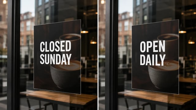
Type the exact words into the prompt — English titles, Chinese product names, small packaging lines. Great when the image must show more than one language.

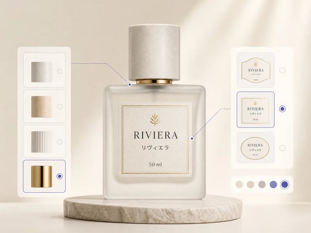
Packaging sample with clear Chinese and English product names

Sharp enough for print and big screens

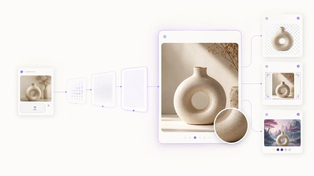
The image comes out detailed by itself. Good for packaging samples and large screens. You often do not need a separate tool to enlarge it.

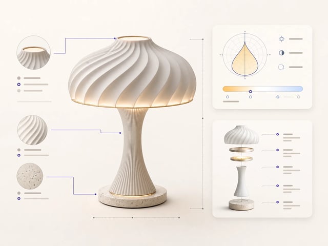
Close-up sample with fine lines and clear small text

Change one part — keep the rest

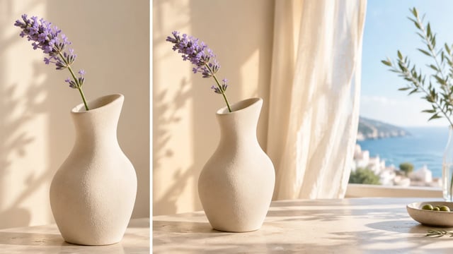
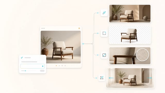
Upload a photo you already like. Say what to change: a new title, a new badge, or one section. Generate when you start fresh; edit when the photo is mostly right.

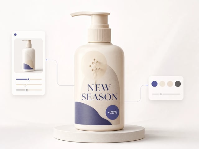
Same product photo with only the title and badge updated
How to use it

Four steps to make an image with Reve 2.1

From idea to a downloadable image — no need to rebuild the layout in another app.

1
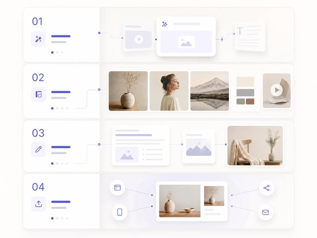
Write the sections and the words first

Write the sections and the words first

How many blocks, what the title says, what every label says. Write that first, then lighting and materials.

2
Pick the shape — or leave it on auto

Pick the shape — or leave it on auto

Wide, tall, square, and more. The result is detailed enough for busy designs.

3
Make 1 image — or up to 4

Make 1 image — or up to 4

Try one first, or make a few versions and pick the best.

4
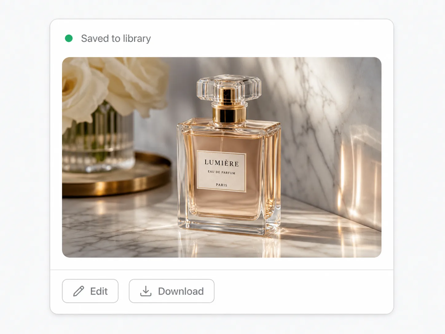
Download — or change one small thing

Download — or change one small thing

Happy with it? Download. Need a fix? Upload it and change only the line, badge, or section that is still wrong.

Who it is for

Reve 2.1 for packaging, posters, and UI screens

Best when the image needs clear titles and sections — not only a soft portrait photo.

People making packaging and labels

Build a package front with brand name, weight, and Chinese or English small text. Later, swap one badge without remaking the whole bottle.

People making event posters

Put the main title, sub title, and small text each in their own place so the poster does not look crowded.

People making app or website screens

Design homepage and app mockups where menu and button text stay easy to read.

People making how-to graphics

Make step graphics and section diagrams. Small text stays clear when you zoom or print.

Common questions about Reve 2.1

When should I use Reve 2.1 instead of GPT Image 2 for text in images?

Use Reve 2.1 when the problem is messy sections, packaging layout, or Chinese and English that must both stay clear. Use GPT Image 2 when you want to try a few words quickly, then raise quality later. Both can put text in an image; Reve 2.1 is better at neat layouts.

What should I write in the prompt?

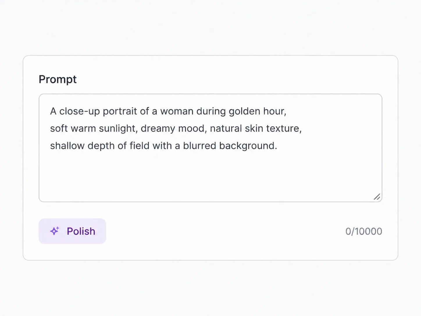
First write how many sections, what to look at first, and the exact titles and labels. Then add materials and light. Write every Chinese or English line exactly. Mark empty space for text so you get a real layout, not only a mood picture.

Can I choose 1K, 2K, or 4K like other models?

There is no separate 1K / 2K / 4K menu. You mainly choose the image shape (or auto) and how many images to make (1–4). The result is detailed by itself — good for busy samples and large screens.

Can I edit a photo I already have?

Yes. Choose image-to-image, upload a photo, and say what to change in normal words — new title, one section, keep the product. Great when the photo is already mostly right.

How many images can I make in one run?

From 1 to 4. Make one while you try ideas; make more when you want a few options to choose from.

Can I use the images for client work?

Yes — on a paid SupaImagine plan you can use them in client materials and packaging samples. You still need to clear other people’s brands or stock assets yourself.

Still stuck with messy layouts and hard-to-read text?

Write the sections and words, generate with Reve 2.1 — or upload a photo and change only that one line.